A website rebuilt around a new brand
A museum station that wakes when you approach and plays its film in your language.
- Project title
- Development of an application for an interactive commentary station (Entwicklung einer Applikation für eine interaktive Kommentarstation)
- Role
- Sole developer: requirements, architecture, implementation, testing, documentation
- Context
- IHK final project, application developer training at inSynergie GmbH
- Timeframe
- 80 hours, 2025
- Stack
- BrightSign, BrightAuthor:connected, Neuroomnet, RFID, PIR motion sensor, UDP
- Status
- Delivered, signed off without reservations
Intro
Muskau Park lies on both sides of the German–Polish border, and its Villa Pückler exhibition follows the prince on his journey through the Orient. Visitors arrive from both sides of that border, so the museum wanted comment stations along the route that tell each story in German, Polish or English.
The stations had to meet two needs that pull in opposite directions: inviting enough to catch a visitor's eye, and quiet enough to run all day with no staff, little power in an empty room, and no technician for routine use. My job, as my IHK final project, was the software - a robust, low-maintenance system that autonomously controls the whole flow of the station.
Highlights
Four behaviors carry the project. Each is a problem I was handed and the decision I made.
AWakes on approach
A station must catch your eye, but it can't run its screen all day. So the screen stays in sleep mode until a visitor triggers the PIR motion sensor. The sensor is wired straight into the BrightSign player's input pins and the player passes the ping on to Neuroomnet, the central media control - no extra hardware anywhere. Neuroomnet wakes the station and starts the introduction film: a portrait comes to life and invites the visitor closer.
BLanguage from the ticket
A station cannot see which language the person in front of it prefers, so the language is decided at the ticket desk: staff pick it on a dashboard and scan the visitor's RFID ticket, which binds the two together in Neuroomnet's ticket list. At the station, the visitor taps the ticket; the reader's UDP message reaches a Neuroomnet script, which looks up the stored language and answers with the matching play command. Two modules carry this: the language-assignment dashboard with the logic behind it, and the Neuroomnet scripts that process the incoming UDP signals.
CNothing interrupts a film
On a busy floor, people walk past mid-film and tap their tickets out of curiosity. A film cut in half spoils the visit for everyone in the room. So while the main film plays, the station locks its ticket reader and ignores new sensor pings; the reader unlocks the moment the film ends.
DSleeps when the room empties
The energy requirement does not end when the film does. After each playback the application returns to a defined idle state, waiting for the next visitor; if the sensor stays quiet past a timeout, it drops into sleep mode until someone approaches again. Every state the station can be in is named and reachable - which is exactly what made every state testable.
Proof
- 22 of 22 test cases passed; signed off without reservations
- ~130 ms from ticket tap to play command, against a 2-second requirement
- Delivered within the 80-hour budget
- One application, running six or more stations
The whole loop
One top-level animation shows the entire system — everything a live demo would show, without hardware in the browser. Each step is a chip; each chip links to the highlight that explains it.
- Ticket desk - language assigned to the RFID ticket B
- Visitor approaches the station A
- PIR sensor triggers, signal to Neuroomnet A
- Station wakes and plays the intro A
- Portrait invites an RFID tap B
- Neuroomnet reads the stored language B
- Language-appropriate playback, input locked C
- Film ends, back to idle D
- Timeout, sleep mode D
Summary
The project was delivered in budget and signed off without reservations. It also threw me in at the deep end: networking and hardware integration were both new to me, and most of the hard problems lived in the gap between the two systems rather than inside either one - like the controller that silently ignored every message until I traced the traffic and found it expected a "#" at the end of each one. That lesson stuck: test on the real hardware, early. Working in visual tools taught me a second one - when there is no code to read, the structure of the states and messages is the design, so it has to be clear to the next person who opens it.
If I extended the system today, I would move the films and the language list into a central content management system, so the museum could update every station from one place.
Client: Stiftung Fürst-Pückler-Park Bad Muskau · Exhibition design: KOCMOC Exhibitions GmbH · Films: m box bewegtbild GmbH · Supervision at inSynergie: Lisa Rau, Martin Bosshart.
My part was the software. Hardware installation, on-site network setup and the films were handled by others.
Eine Museumsstation, die erwacht, sobald man sich nähert, und ihren Film in der eigenen Sprache zeigt.
- Projekttitel
- Entwicklung einer Applikation für eine interaktive Kommentarstation
- Rolle
- Alleinentwickler: Anforderungen, Architektur, Umsetzung, Test, Dokumentation
- Kontext
- IHK-Abschlussprojekt, Ausbildung zum Fachinformatiker für Anwendungsentwicklung bei der inSynergie GmbH
- Zeitraum
- 80 Stunden, 2025
- Stack
- BrightSign, BrightAuthor:connected, Neuroomnet, RFID, PIR-Bewegungssensor, UDP
- Status
- Ausgeliefert, vorbehaltlos abgenommen
Einleitung
Der Muskauer Park liegt beiderseits der deutsch-polnischen Grenze, und die Ausstellung „Villa Pückler“ folgt dem Fürsten auf seiner Reise durch den Orient. Das Publikum kommt von beiden Seiten dieser Grenze, deshalb wünschte sich das Museum entlang des Rundgangs Kommentarstationen, die jede Geschichte auf Deutsch, Polnisch oder Englisch erzählen.
Die Stationen mussten zwei Anforderungen erfüllen, die einander widersprechen: einladend genug, um Blicke auf sich zu ziehen, und zurückhaltend genug, um den ganzen Tag ohne Personal zu laufen, im leeren Raum kaum Strom zu verbrauchen und im Alltagsbetrieb ohne Techniker auszukommen. Meine Aufgabe in meinem IHK-Abschlussprojekt war die Software - ein robustes, wartungsarmes System, das den gesamten Ablauf der Station autonom steuert.
Highlights
Vier Verhaltensweisen tragen das Projekt. Jede ist ein Problem, das mir gestellt wurde, und die Entscheidung, die ich dafür getroffen habe.
AErwacht, wenn man sich nähert
Eine Station muss Blicke auf sich ziehen, darf ihren Bildschirm aber nicht den ganzen Tag laufen lassen. Deshalb bleibt der Bildschirm im Schlafmodus, bis ein Besucher den PIR-Sensor auslöst. Der Sensor ist direkt an die Eingangs-Pins des BrightSign-Players angeschlossen, und der Player meldet das Signal an Neuroomnet weiter, die zentrale Mediensteuerung - ganz ohne zusätzliche Hardware. Neuroomnet weckt die Station und startet den Einführungsfilm: Ein Porträt wird lebendig und lädt den Besucher ein, näherzutreten.
BSprachwahl per Ticket
Eine Station kann nicht sehen, welche Sprache die Person vor ihr bevorzugt. Deshalb wird die Sprache an der Kasse festgelegt: Das Personal wählt sie in einem Dashboard aus und scannt das RFID-Ticket des Besuchers, wodurch beides in der Ticketliste von Neuroomnet verknüpft wird. An der Station hält der Besucher das Ticket an den Leser; dessen UDP-Nachricht erreicht ein Neuroomnet-Skript, das die gespeicherte Sprache nachschlägt und mit dem passenden Abspielbefehl antwortet. Zwei Module tragen diese Funktion: das Dashboard zur Sprachzuweisung mit der Logik dahinter und die Neuroomnet-Skripte, die die eingehenden UDP-Signale verarbeiten.
CNichts unterbricht einen Film
In einer belebten Ausstellung gehen Menschen mitten im Film vorbei und halten aus Neugier ihr Ticket an den Leser. Ein mittendrin abgebrochener Film verdirbt allen im Raum den Besuch. Deshalb sperrt die Station während des Hauptfilms ihren Ticketleser und ignoriert neue Sensorsignale; der Leser wird wieder freigegeben, sobald der Film endet.
DSchläft, wenn der Raum sich leert
Die Anforderung, Energie zu sparen, endet nicht mit dem Film. Nach jeder Wiedergabe kehrt die Applikation in einen definierten Ruhezustand zurück und wartet auf den nächsten Besucher; bleibt der Sensor bis zum Ablauf eines Timeouts still, wechselt sie in den Schlafmodus, bis sich wieder jemand nähert. Jeder Zustand, den die Station einnehmen kann, ist benannt und erreichbar – und genau das machte jeden Zustand testbar.
Belege
- 22 von 22 Testfällen bestanden; vorbehaltlos abgenommen
- ~130 ms vom Auflegen des Tickets bis zum Abspielbefehl – gefordert waren 2 Sekunden
- Innerhalb des Budgets von 80 Stunden geliefert
- Eine Applikation für sechs oder mehr Stationen
Der gesamte Ablauf
Eine übergeordnete Animation zeigt das gesamte System – alles, was eine Live-Vorführung zeigen würde, ohne Hardware im Browser. Jeder Schritt ist ein Chip; jeder Chip verlinkt auf das Highlight, das ihn erklärt.
- Kasse - Sprache wird dem RFID-Ticket zugewiesen B
- Besucher nähert sich der Station A
- PIR-Sensor löst aus, Signal an Neuroomnet A
- Station erwacht und spielt den Einführungsfilm A
- Porträt lädt zum Auflegen des RFID-Tickets ein B
- Neuroomnet liest die gespeicherte Sprache aus B
- Wiedergabe in der passenden Sprache, Eingabe gesperrt C
- Film endet, zurück in den Ruhezustand D
- Timeout, Schlafmodus D
Fazit
Das Projekt wurde im Budget geliefert und vorbehaltlos abgenommen. Es hat mich außerdem ins kalte Wasser geworfen: Netzwerktechnik und Hardware-Integration waren beide neu für mich, und die meisten schwierigen Probleme lagen in der Lücke zwischen den beiden Systemen, nicht in einem davon - etwa die Steuerung, die jede Nachricht stillschweigend ignorierte, bis ich den Datenverkehr mitschnitt und feststellte, dass sie am Ende jeder Nachricht ein „#“ erwartete. Diese Lektion ist geblieben: früh auf der echten Hardware testen. Die Arbeit mit visuellen Werkzeugen hat mich eine zweite gelehrt: Wenn es keinen Code zum Lesen gibt, ist die Struktur der Zustände und Nachrichten das Design - also muss sie für die nächste Person, die das Projekt öffnet, klar sein.
Bei einer Erweiterung würde ich heute die Filme und die Sprachliste in ein zentrales Content-Management-System verlagern, damit das Museum alle Stationen von einer Stelle aus aktualisieren kann.
Auftraggeber: Stiftung Fürst-Pückler-Park Bad Muskau · Ausstellungsgestaltung: KOCMOC Exhibitions GmbH · Filme: m box bewegtbild GmbH · Betreuung bei inSynergie: Lisa Rau, Martin Bosshart.
Mein Anteil war die Software. Die Installation der Hardware, die Netzwerkeinrichtung vor Ort und die Filme übernahmen andere.
A car park website that people, search engines and AI assistants can all read and trust, in three languages.
- Role
- Sole designer and developer: audit, requirements, design, build, testing
- Context
- Self-initiated proposal to a family-run car park in a German city centre
- Timeframe
- 52 hours planned, September–October 2026
- Tools
- Astro, TypeScript, schema.org JSON-LD, Vitest, Playwright, axe-core
- Status
- Proposal
The brief
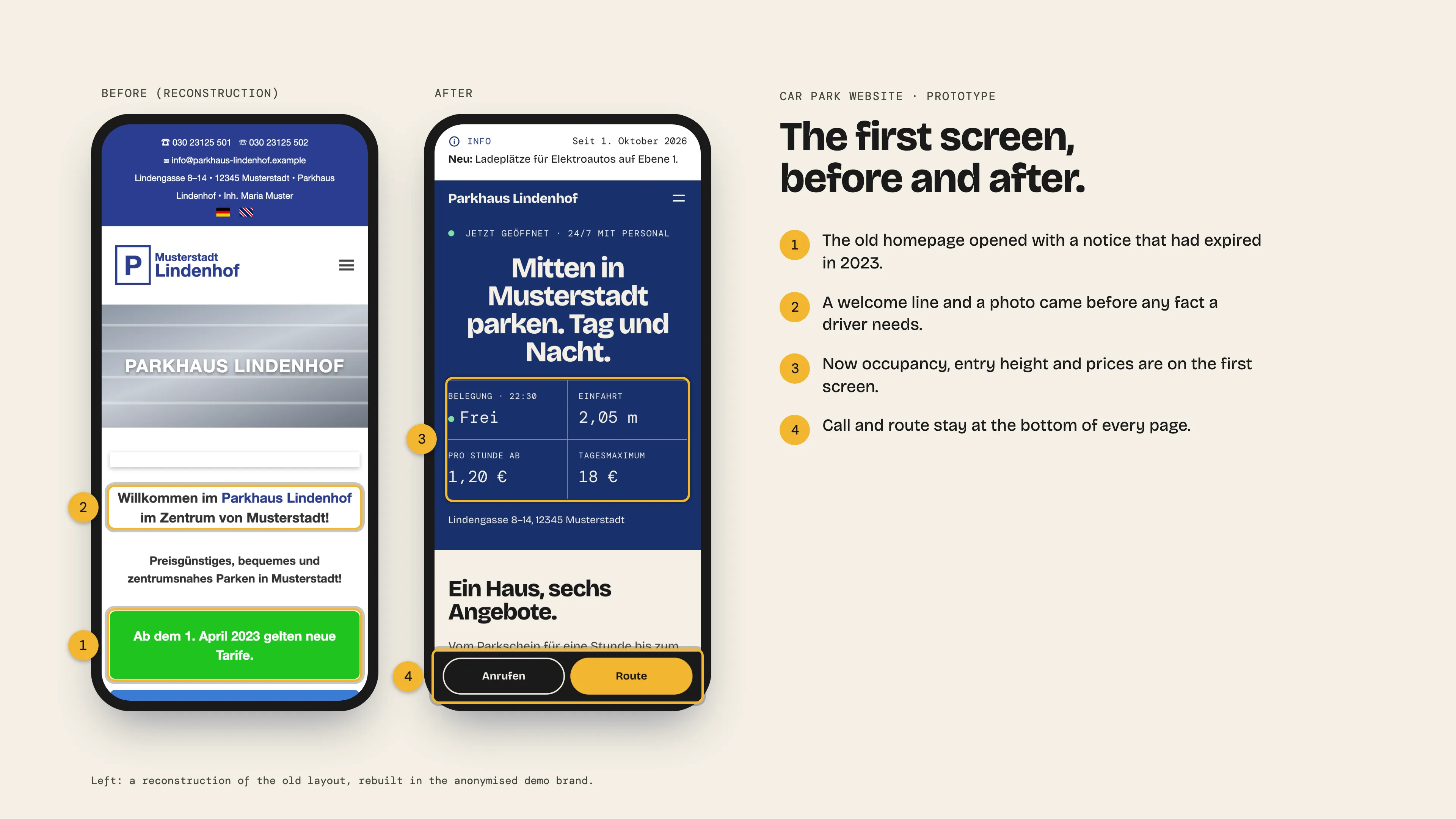
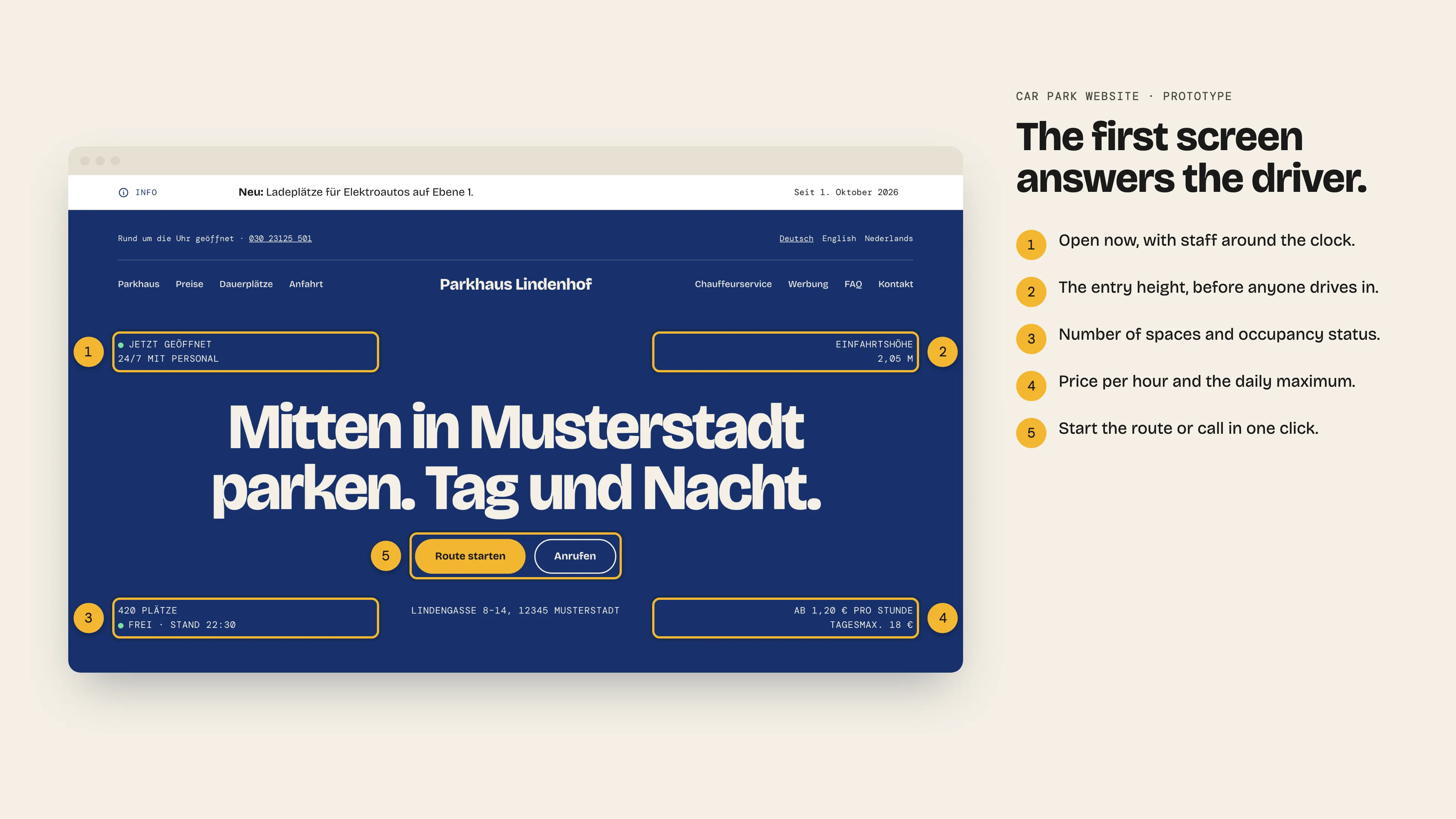
A family-run car park earns from more than hourly parking: monthly spaces, a chauffeur service, advertising, a prepaid ticket and EV charging. A lot of customers, especially today, decide on a phone, through a search engine, a map app or an AI assistant, and act on whatever answer they find. My audit found the site failing them. Expired notices came first, the height limit differed between two pages, the free-space count was an image, and the English page renamed the business. Information around the website isn't generally easily accessible.
What it does
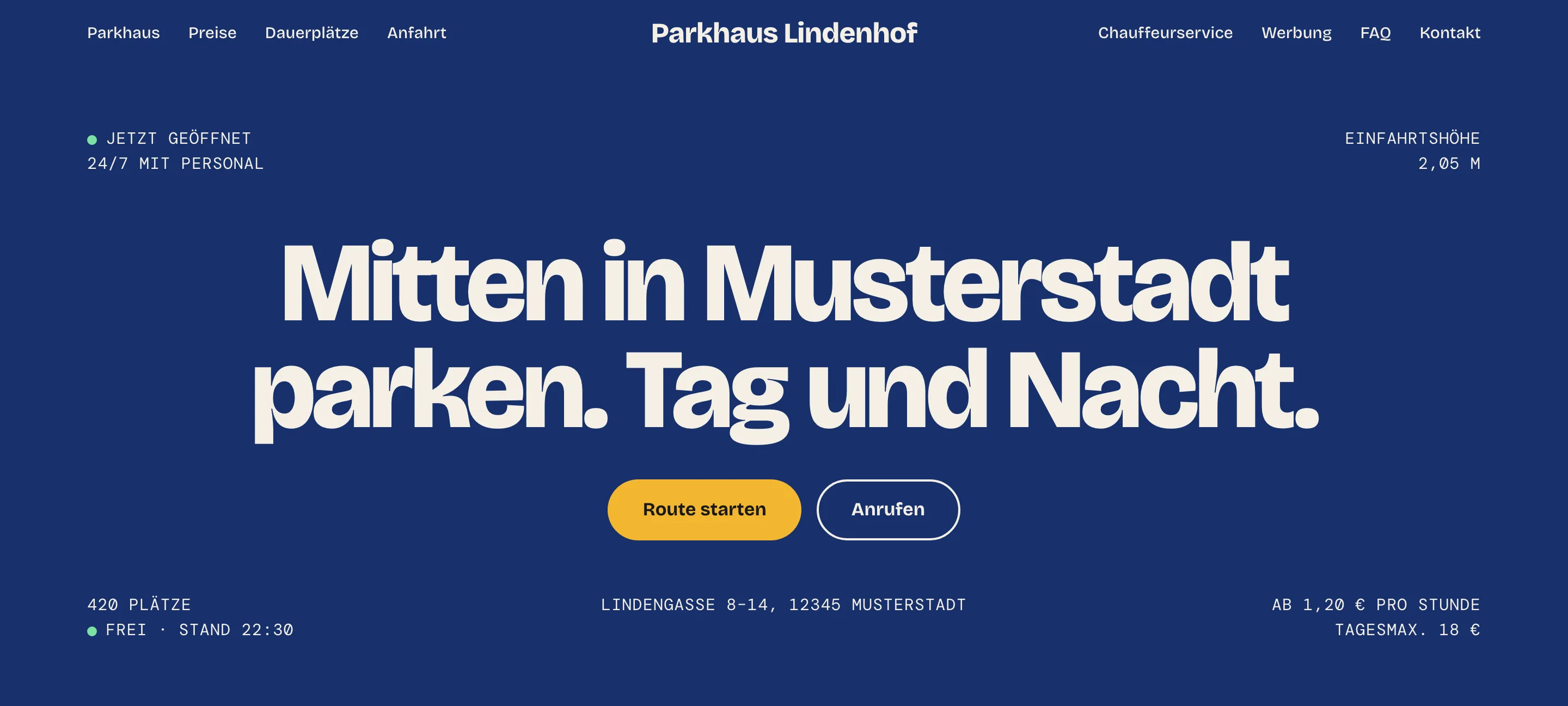
The site opens with what a driver needs: is it open, how many spaces, how high, what does it cost, with call and directions one tap away. Every service makes its own case, from monthly spaces to the chauffeur service and advertising, each with a way to ask. Notices appear and disappear on their own dates, and a date picker shows the owner any day. Visitors in three languages, search engines and AI assistants all get the same facts.
What it took
AAn audit before an offer
Instead of pitching a redesign straight away, I went through the live site page by page and wrote down what worked, as well as things that could use an update. The audit formed the foundation for the project and defined the scope of work to be done.
BOne set of facts for people and machines
Prices, hours and the height limit are written once, in one file. Every page in every language reads them, and so does the structured data that search engines and AI agents read. Carnival and holiday dates are computed, not typed, so the parade closure appears on the page and in the machine-readable opening hours from the same date.
CAccessibility
A screen reader and a search engine have the same problem: neither can see the page. Both need real headings, links that say where they go, and text instead of pictures of text, so building for one serves the other. Germany's accessibility law (BFSG) probably doesn't cover a site this small, but I held the work to WCAG 2.2 AA anyway and tested for it from the first page.
DTranslations that can't change a fact
The office writes only German. Before an English or Dutch draft counts, a check confirms that every number, time, price and link from the German survived and that key terms follow a glossary. If the German changes, the old translation stops showing until a new one passes. Legal pages stay German.
Where it stands
- The site is built: 12 pages in German, the 9 public ones also in English and Dutch
- 254 unit tests and an axe-core scan that finds no WCAG 2.2 A or AA violation
- Automated scans catch only part of WCAG, so a manual check with a screen reader is still to do
- Next: a native speaker reviews the English and Dutch text, then the presentation to the owner. The real-brand version stays private until the owner agrees in writing
The content comes from the business's current website. I drafted the English and Dutch text with AI help.
Eine Parkhaus-Website, die Menschen, Suchmaschinen und KI-Assistenten gleichermaßen lesen können und der sie vertrauen - in drei Sprachen.
- Rolle
- Alleiniger Designer und Entwickler: Audit, Anforderungen, Design, Umsetzung, Test
- Kontext
- Initiativangebot an ein familiengeführtes Parkhaus in einer deutschen Innenstadt
- Zeitraum
- 52 Stunden geplant, September–Oktober 2026
- Werkzeuge
- Astro, TypeScript, schema.org JSON-LD, Vitest, Playwright, axe-core
- Status
- Angebot
Die Ausgangslage
Ein familiengeführtes Parkhaus verdient an mehr als dem Parken nach Stunden: Dauerplätze, ein Chauffeurservice, Werbung, ein Prepaid-Ticket und Laden für Elektroautos. Viele Kunden entscheiden heute auf dem Handy, über eine Suchmaschine, eine Karten-App oder einen KI-Assistenten, und handeln nach der Antwort, die sie dort finden. Mein Audit zeigte, dass die Website sie im Stich ließ. Abgelaufene Hinweise standen ganz oben, die Einfahrtshöhe unterschied sich zwischen zwei Seiten, die Zahl der freien Plätze war ein Bild, und die englische Seite gab dem Betrieb einen anderen Namen. Die Informationen rund um die Website sind insgesamt nicht leicht zugänglich.
Was sie leistet
Die Website beginnt mit dem, was Autofahrer brauchen: Ist geöffnet, wie viele Plätze gibt es, wie hoch ist die Einfahrt, was kostet es - Anrufen und Route sind einen Tipp entfernt. Jedes Angebot spricht für sich, von den Dauerplätzen bis zum Chauffeurservice und zur Werbung, jeweils mit einer Möglichkeit zur Anfrage. Hinweise erscheinen und verschwinden an ihrem eigenen Datum, und eine Datumsvorschau zeigt dem Inhaber jeden beliebigen Tag. Besucher in drei Sprachen, Suchmaschinen und KI-Assistenten erhalten alle dieselben Fakten.
Was es brauchte
AEin Audit vor dem Angebot
Statt sofort ein Redesign anzubieten, bin ich die bestehende Website Seite für Seite durchgegangen und habe notiert, was funktioniert und was eine Überarbeitung vertragen könnte. Das Audit bildete die Grundlage des Projekts und legte den Arbeitsumfang fest.
BEine Faktenbasis für Menschen und Maschinen
Preise, Öffnungszeiten und die Einfahrtshöhe stehen ein einziges Mal in einer Datei. Jede Seite in jeder Sprache liest sie von dort, ebenso die strukturierten Daten, die Suchmaschinen und KI-Agenten auslesen. Karnevals- und Feiertage werden berechnet statt eingetippt, deshalb erscheint die Sperrung während des Umzugs auf der Seite und in den maschinenlesbaren Öffnungszeiten aus demselben Datum.
CBarrierefreiheit
Ein Screenreader und eine Suchmaschine haben dasselbe Problem: Keiner von beiden sieht die Seite. Beide brauchen echte Überschriften, Links, die sagen, wohin sie führen, und Text statt Bildern von Text - wer für den einen baut, baut also auch für den anderen. Das Barrierefreiheitsstärkungsgesetz (BFSG) gilt für eine so kleine Website wahrscheinlich nicht, trotzdem habe ich die Arbeit an WCAG 2.2 AA ausgerichtet und ab der ersten Seite darauf getestet.
DÜbersetzungen, die keinen Fakt ändern können
Das Büro schreibt nur auf Deutsch. Bevor ein englischer oder niederländischer Entwurf zählt, bestätigt eine Prüfung, dass jede Zahl, jede Uhrzeit, jeder Preis und jeder Link aus dem Deutschen erhalten geblieben ist und Schlüsselbegriffe einem Glossar folgen. Ändert sich der deutsche Text, wird die alte Übersetzung ausgeblendet, bis eine neue die Prüfung besteht. Rechtstexte bleiben auf Deutsch.
Stand der Dinge
- Die Website steht: 12 Seiten auf Deutsch, die 9 öffentlichen auch auf Englisch und Niederländisch
- 254 Unit-Tests und ein axe-core-Scan, der keinen Verstoß gegen WCAG 2.2 A oder AA findet
- Automatische Scans erfassen nur einen Teil der WCAG, deshalb steht eine manuelle Prüfung mit Screenreader noch aus
- Als Nächstes: Muttersprachler prüfen den englischen und niederländischen Text, danach folgt die Präsentation beim Inhaber. Die Version mit der echten Marke bleibt privat, bis der Inhaber schriftlich zustimmt
Die Inhalte stammen von der aktuellen Website des Betriebs. Den englischen und niederländischen Text habe ich mit KI-Unterstützung entworfen.
AMP Global is a music investment company. It invests in music rights and music-driven platforms in emerging and high-growth regions, from Africa to Latin America. As part of a rebranding project by ATIDE Studios, AMP's website had to change to match the new brand. I was the sole developer, from layout sketches to launch.
- Role
- Sole developer, from layout sketches to launch
- Context
- Website for the AMP Global rebrand by ATIDE Studios
- Stack
- Astro, Keystatic CMS, Vercel, Canvas 2D
- Status
- Live at ampglobalent.com
Problem
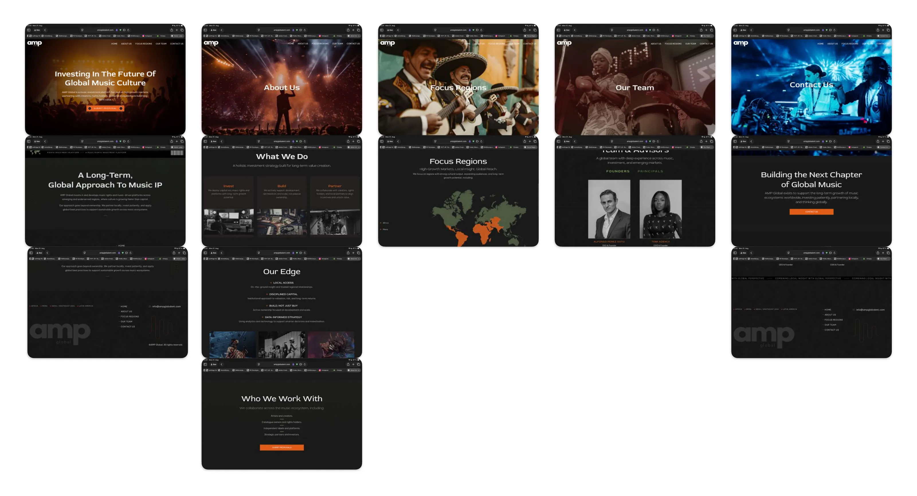
The old site no longer matched the brand, and it did not hold together. Every page opened on a different photo with its own colour cast, from orange to red to deep blue. Sections switched between cards, maps, icon lists and centred text blocks, so each page felt like a separate site.
Approach
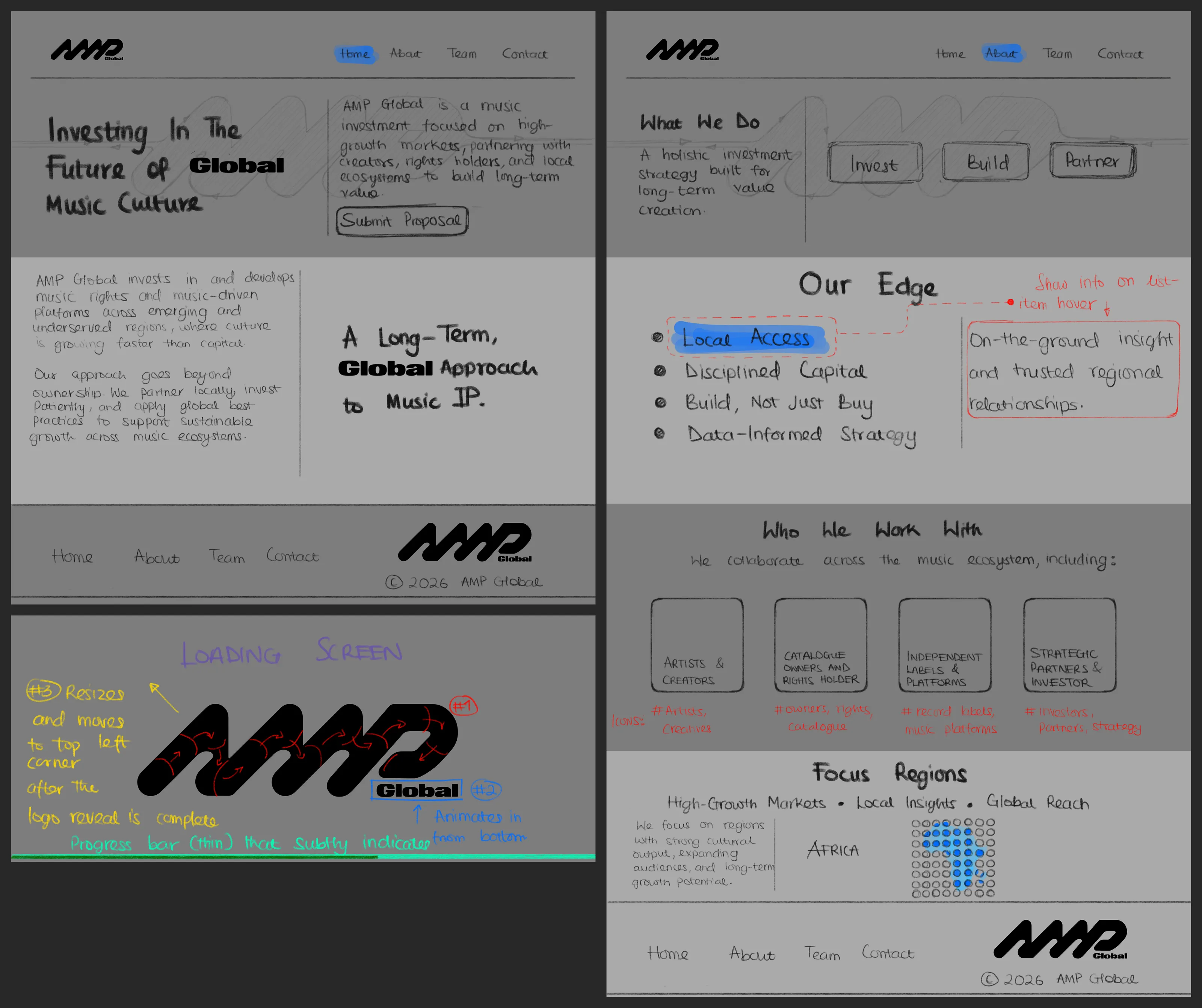
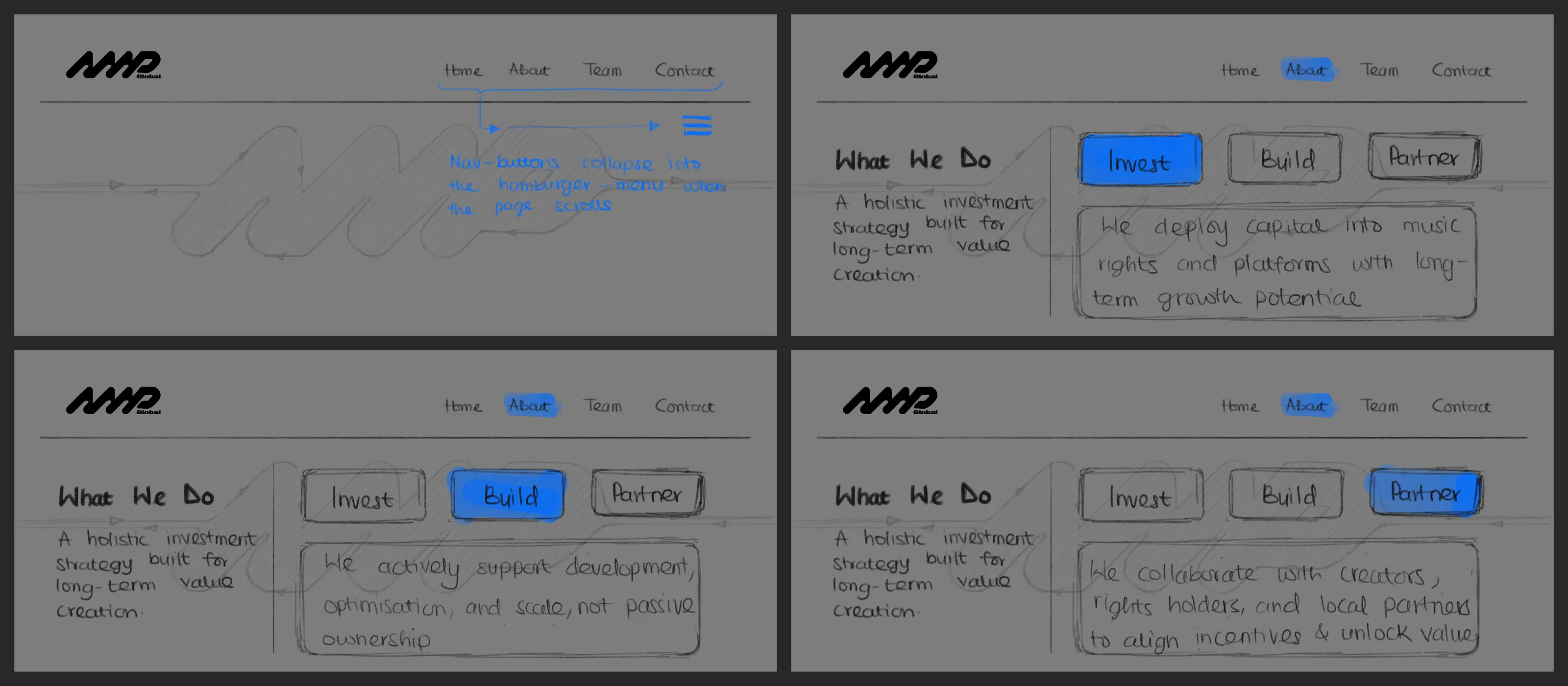
The goals were a clear site that matches the new brand on every page and is easy to navigate. I started on paper, sketching the layouts before writing any code.
The highlight is the matrix: a fine grid of dots behind the content that reacts to the cursor. I designed it for maximum control. I built it in isolation and exposed every value, from dot size and spacing to cursor reach, strength and falloff, as a live control. That made refining the feel of the interaction relatively easy: I could tune it by eye, then lock the values in.
Outcome
The new site is live at ampglobalent.com and carries the new brand from the first screen to the footer. The navigation now has four clear pages instead of five, with the focus regions on the homepage. A built-in CMS lets AMP's team update content themselves, so changes no longer need a developer.
AMP Global ist ein Musik-Investmentunternehmen. Es investiert in Musikrechte und musikgetriebene Plattformen in aufstrebenden, wachstumsstarken Regionen, von Afrika bis Lateinamerika. Im Rahmen eines Rebrandings durch ATIDE Studios musste sich auch die Website von AMP an die neue Marke anpassen. Ich war der alleinige Entwickler, von den Layout-Skizzen bis zum Launch.
- Rolle
- Alleinentwickler, von den Layout-Skizzen bis zum Launch
- Kontext
- Website zum Rebranding von AMP Global durch ATIDE Studios
- Stack
- Astro, Keystatic CMS, Vercel, Canvas 2D
- Status
- Live unter ampglobalent.com
Problem
Die alte Website passte nicht mehr zur Marke, und sie hielt nicht zusammen. Jede Seite begann mit einem anderen Foto mit eigenem Farbstich, von Orange über Rot bis Dunkelblau. Die Abschnitte wechselten zwischen Karten, Landkarten, Icon-Listen und zentrierten Textblöcken, sodass sich jede Seite wie eine eigene Website anfühlte.
Vorgehen
Die Ziele waren eine klare Website, die auf jeder Seite zur neuen Marke passt und leicht zu navigieren ist. Ich habe auf Papier begonnen und die Layouts skizziert, bevor ich eine Zeile Code geschrieben habe.
Das Highlight ist die Matrix: ein feines Punktraster hinter den Inhalten, das auf den Cursor reagiert. Ich habe sie auf maximale Kontrolle ausgelegt. Ich habe sie isoliert gebaut und jeden Wert, von Punktgröße und -abstand bis zu Reichweite, Stärke und Abfall des Cursors, als Live-Regler zugänglich gemacht. Dadurch ließ sich das Gefühl der Interaktion vergleichsweise leicht verfeinern: Ich konnte sie nach Augenmaß abstimmen und die Werte dann festschreiben.
Ergebnis
Die neue Website ist unter ampglobalent.com live und trägt die neue Marke vom ersten Bildschirm bis zum Footer. Die Navigation hat jetzt vier klare Seiten statt fünf, mit den Fokusregionen auf der Startseite. Ein integriertes CMS ermöglicht es dem Team von AMP, Inhalte selbst zu pflegen, sodass Änderungen keinen Entwickler mehr brauchen.